
Refining Export and Checkout Flows: Ad Intel
Background
What is Numerator and Ad Intel?
Numerator is a Chicago-based company that blends proprietary data with advanced technology to create unique insights for the market research industry.
Ad Intel is one of Numerator's fastest growing products in advertising landscape. It is an ad tracking platform that searches across all media channels and media types that helps clients understand the competitive market and effectiveness of advertising.
The Challenge
Users want a Library where they can search across Numerator’s entire universe of ads. User can filter through in-access, out-of-access and purchased ads. We need a way to unify the export functionality across all ad types (in/out/purchased access).
My Role
I am the sole designer for the Ad Intel product. I am responsible for the Understanding the User, Interaction, Visual design, Prototyping, and Testing.
My Process
This is my typical design process for projects. I start by understanding the user needs and observing the current user experience within the product. Then I converge and define the objectives to a specific problem. Once the scope is defined, I brainstorm potential solutions and ideas. Then I create mockups to test with clients and ideate with updated revisions based on their feedback in order to reach the best solution possible.

Image: My Design Process
The Problem
What was the original experience?
In order to access digital ads, users must checkout and export them first beforehand. The checkout and export functions were initially merged into one flow, creating confusion and lack of clarity when purchasing digital ads. This current flow had been used in Ad Intel's older versions of the platform, but after a full reskin of the Ad Intel product, both legacy and an influx of new users have found the user experience disorganized. Users have to constantly shift between two dashboards to get all ads of a specific criteria.


Images: Screenshots from the existing (and lengthy!) checkout & export flows

Image: Original experience flow for exporting different types of ads
Pain Points
For the project kickoff, I met with Ad Intel's product manager and director of product to discuss the asks and needs for this UX feature improvement. After a thorough walkthrough of the export and checkout functions, we were able to list the pain points that helped us not only define the scope of this project, but also prioritize the pain points for our objective.

Image: Pain points of the current export flow
Empathize
User Research
About 90% of Ad Intel's users are power users and have been utilizing the platform for more than 10 years. After speaking numerous times with the commercial team who has consistently used the platform, I had a better understanding of who our audience is, specifically for the export and checkout functions. We have experienced users who are more reluctant to changes in the Ad Intel platform and new users, though subject matter experts, who have no idea how to use the tool. The tricky part of this was to find the balance that solves our pain points, yet makes the function more intuitive and user friendly.
Task Flow
With the users in mind, I created a couple task flows that had answered the question of how to simplify these merged export and checkout flows: divorcing the export and checkout flows completely, yet keeping both in a singular process. By doing this, the user had a better understanding of knowing exactly where they were in the flow without jumping back and forth between the two flows.

Image: Task Flow for future checkout & export flows
Define
Objectives
After conducting user research both experienced and new users, I was able to streamline the objectives our team would be solving for:
-
Create a refined user experience that would better navigate through the export and checkout functions
-
Reduce the functionality throughout the Ad Intel product to improve platform performance
Ideate
Low Fidelity Mockups
I created lo-fi mockups and wireframes to create the task flows at hand and use cases building off of that. The value of lo-fi mockups really pulled through with this project. When presenting the functionality of the lo-fi mockups to our commercial team, they responded with nothing but silence. Though the user experience had drastically improved, there was a step in the process that tied the export and checkout functions together; thus still making the flow confusing.
I revisited the task flows to see where I went wrong. Having a visual map proved to be helpful because I was able to pinpoint exactly where my mishap had occurred and fix the problem immediately in the task flows and lo-fi mockups. This ideation in the design process prevented more mistakes and confusion happening down the road, and when presenting the new lo-fi mockups to our commercial team, they were pleased with the improvements and so was I.

Image: Wireframes
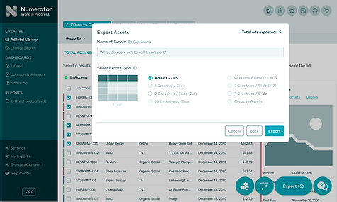
Prototype & Test
High Fidelity Clickable Prototypes
After we defined the proper use cases and its flows, I built the high fidelity prototypes. Though the conversion from lo-fi to hi-fi was overall seamless, we were met with some aesthetic nuances and interaction points that we had to figure out. Since Ad Intel falls under Numerator's product line, I used the corresponding color palette and components.
Image: Hi-fi Prototypes
Click here to view the full prototype.
Testing with the Commercial Team
When testing with the commercial team, we were met with a couple use cases that had not been initially solved, such as error states and some what-if's. Like any process, there are bound to be some bumps in the road, but testing from the lo-fi mockup stage had proven to be extremely helpful. From a dev standpoint, there were minimal bugs when it came to design implementation.


Outcome
We solved the problems we had initially set out on. Separating the flows from a merged one had clarified a lot of confusion for the users, and grouping items together in the checkout process had improve platform performance drastically.
I was very pleased with the outcome of this project. Before starting this, our design team had no structure in process to work off of. Everyone worked to their own pace. I built my own design feature framework, and this project was the first one I tested it out on. The structure of my framework had kept this within the timeline of what was expected, and I'm happy to say that this UX feature project has been successful. I had overseen all design matters pull through all the way from the project kickoff to implementation, so there wasn't very many surprises along the way.
Key Takeaways
1. Prioritize, prioritize, PRIORITIZE! It's very easy to get caught up in various design problems we come across along the way. Sometimes I fix one thing and then another problem arises. I have found that it is important to stick to the purpose of this project. There will always be something else that goes wrong, but it's imperative to focus on the root of the problem.
2. Finding balance within the design process. Creating a new and improved design can be very gratifying, especially when it solves the problem. However, during the project, I have encountered a situation where users are reluctant to substantial changes in the design. Reasonably so, it's not easy to accept change. I've learned to compromise with cross-functional teams in achieving the common goal, and it has worked out well for this project. Design is a step-by-step process where compromise is inevitable, as long as we're taking a step in the right direction.